Health Coaching Business 17 Health Coaching Websites To Inspire Your Design

Can you imagine pouring your heart into a health coaching business that never gets any clients? The website is often to blame. All successful health coaches need a website that works for them, but knowing how to get there is a challenge.
The good thing is we can learn from the examples of others who have done it first. Our curated list of 17 fantastic health coaching websites is sure to get your head flowing with ideas. We’ve assembled sites from across the health coaching spectrum into one accessible package, so let’s get started.
Join Our Community
Become a Certified Health Coach and join a network of empowered clinicians.
Learn More!The Importance of Website Design for Health Coaches
Almost every client interaction with a health coach begins on the internet now. When potential clients look for coaching services, search engines like Google — not the telephone directory — are their go-to. And since a website is almost always a client’s first introduction to their future health coach, creating a great one is vital for anyone learning how to be a health coach online.
What Should You Include on Your Health Coaching Website?
Before we look at actual examples, let’s explore some health coaching website best practices for you to follow. Some health coaching website must-haves include things like:
Clear and Professional Design
A clear and professional website design reflects a strong brand identity. There’s never another chance to make a good first impression.
User-Friendly Interface
A health coach’s website should have seamless navigation. Ideally, visitors can easily find what they’re looking for at a glance.
Client Success Stories
Health coaches need to establish “street credit” with their audience. Prominent portrayals of client success stories are an excellent way to do that. We need to tell new website visitors about the exceptional work we’ve done for others.
Clear Calls-to-Action
Visitors to the site have to know what’s expected of them. We use calls-to-action to tell them exactly what we want them to do. Make sure you tell them to “Sign up for my newsletter” or “Schedule an appointment with me” to avoid confusion.
Credentials
We have to establish our credentials with our audience for them to trust us with their health. Let them know how you learned the skills you’ll use to help them.
Resources for Clients
Upload any informative or insightful educational materials you’ve created. This could include detailed health guides, nutritional recipes, or anything else visitors could find valuable.
Contact Information and Booking Options
Try to see the website from a client’s eyes. If they want to schedule a consultation or come visit you in person, can they find out how to do it? If not, make it easy for them.
Advance Your Career
Elevate your clinical practice with our Health Coach Certification.
Get Certified!17 Stunning Health Coaching Websites
In the previous section, we showed you the elements a health coaching website should include. Now, we’ll look at 17 examples of what this looks like in action. We’ll be exploring different types of websites as well, from holistic health coaching websites to nutrition coaching websites, to develop a more in-depth understanding of what it takes to make a great website.
Website 1 — Holistic Habits with Petra
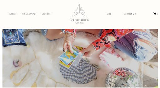
- A detailed About Me section lets readers know what she’s all about.
- Beautiful photos give the site a relaxing aesthetic.
- She takes the time to articulate what she does and how she can help her clients.
Website 2 — Transformation for Real
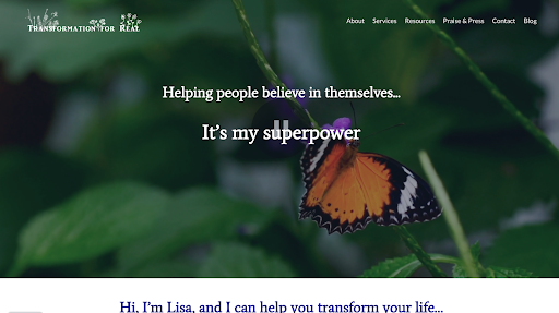
- A beautiful butterfly greets visitors to Transformation for Real’s website, signaling to visitors what is to come.
- Lisa’s credentials, including her feature in LA Weekly, are prominently displayed on the front page.
- The site’s floral aesthetic matches her brand’s identity perfectly.
Website 3 — Bold Habit Quest
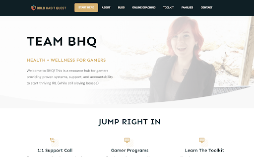
- A “bold” logo greets visitors the moment they come onto the page.
- Easy navigation in the header makes it simple to find what you’re looking for.
- The series of testimonials halfway down the page strikes an immediate impression of credibility.
Website 4 — Create Natural Balance LLC
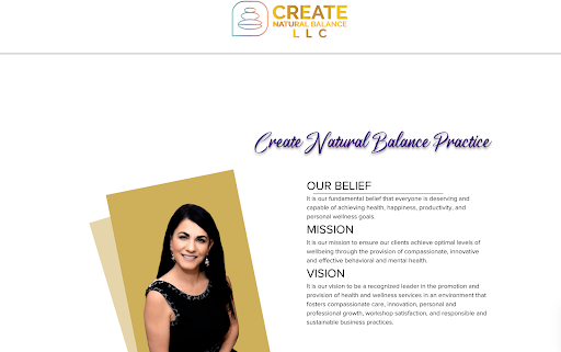
- We love the message conveyed in the company title and across the website: “Create natural balance.”
- The website uses a gorgeous golden color tone that invites visitors right in.
- She showcases her values and vision at the top of the page so that readers can make a fast assessment.
Website 5 — Amphy
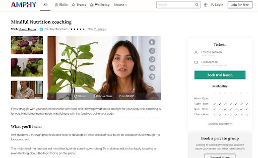
- The video that starts playing upon entering the page immediately grabs our attention.
- Niamh knows how to create a warm, friendly atmosphere in her video, speaking to visitors directly.
- She lists her availability on the first page so that anyone can sign up right away.
Website 6 — Vanderbilt Health Coaching Program
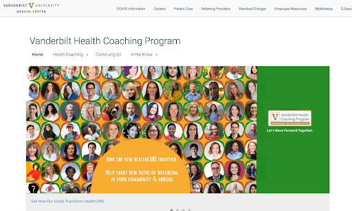
- It does an excellent job leveraging its innate authority as part of the Vanderbilt University system.
- The site displays a strong “Click to register” call-to-action as one of the first things visitors see.
- The “Why choose us?” section gets straight to the point by answering the question that matters most to first-time visitors.
Website 7 — Marielle Alix
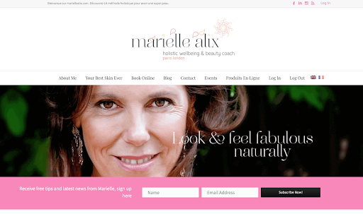
- The color scheme gives a sense of beauty and wellness.
- Showcasing her appearances on such notable platforms as Elle really makes an impression.
- The website’s copy does a magnificent job of drawing visitors in and encouraging them to sign up.
Website 8 — So Fresh N So Green
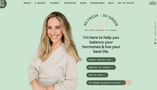
- Who wouldn’t love a company name like that?
- Branding, branding, branding — everything from the color scheme, title, font, and rotating pictures delivers an eminently approachable, nature-oriented approach.
- She includes a series of smart calls-to-action for her viewers to interact with.
Website 9 — Chani Thompson
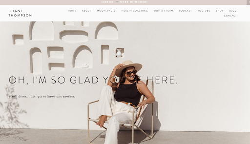
- The header, “Oh, I’m so glad you’re here,” is a great welcome message as it creates a friendly atmosphere.
- The navigation panel allows visitors to access different sections easily.
- It makes a confident offer right away on the front page, inviting visitors to use her Moon Magic calendar immediately.
Website 10 — Christiana Serle
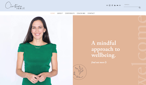
- Christiana specializes in corporate wellness and looks the part.
- The website concisely communicates her services, values, and credentials in a few swipes down the page.
- The professional aesthetic across the website conveys nothing but competence through and through.
Website 11 — Stacy Peasall
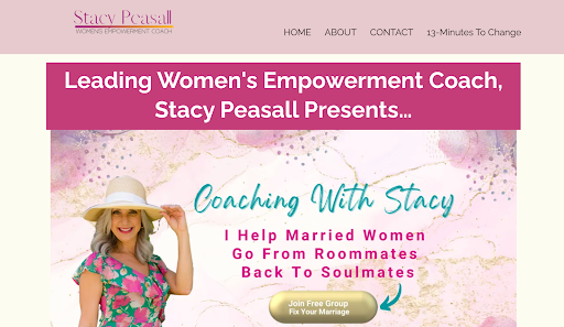
- Stacy tells us clearly who would benefit from her services and who would not — this takes confidence.
- The call-to-action is front and center on her landing page, offering a free resource to anyone interested.
- Excellent copywriting that feels like it’s personally written for each website visitor.
Website 12 — Honestly Healthy
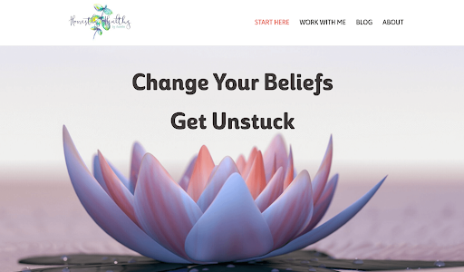
- With the header “Change your beliefs, get unstuck,” she communicates her brand ethos right away.
- A striking header image that visually complements her ethos.
- A panel of long, detailed client reviews tells visitors immediately what to expect.
Website 13 — Amber Haider Coaching
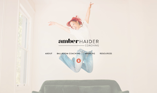
- The header image, featuring Amber joyfully leaping in the air, matches her brand as a ballerina coach perfectly.
- She communicates confidence and warmth on every page.
- The exquisite use of photography makes the readers feel she’s speaking right to them.
Website 14 — Dr. Jo Baldwin
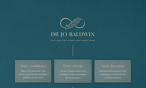
- Blue color schemes are often associated with medical professionals and healing — take note!
- A terrific, evocative logo
- “More confidence, more energy, more direction” — she knows how to travel into visitors’ heads and find what they need most.
Website 15 — Loliya Harrison
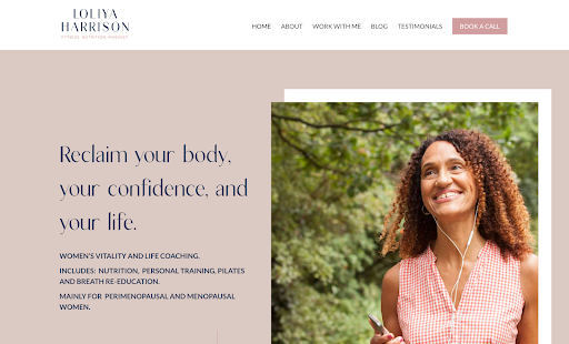
- This is a website that gets straight to the point with excellent copy that flows down the page.
- She clearly announces her target audience of perimenopausal and menopausal women.
- She uses testimonials to build her credibility to great effect.
Website 16 — The Women’s Wellness Society
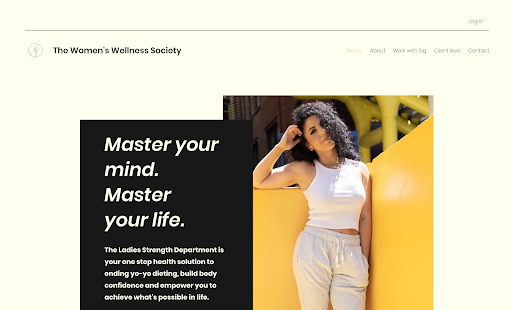
- The gold and black themes are a bold choice that truly works.
- “If you’re looking for the next quick fix, you won’t find it here” — Sigi, a women’s health and nutrition coach, builds client anticipation and trust at the same time.
- The page tastefully layers testimonials and calls-to-action throughout.
Website 17 — Hug
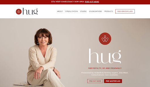
- Last but absolutely not least: The branding and layout on Zita West’s page are something to behold.
- She knows her audience — women concerned with their fertility — and speaks directly (and poignantly) to them.
- Powerful endorsements from the Telegraph and even Kate Winslet round out a stunning website.
Best Website Builder for Health Coaches
Health coaches can use premium website builders to create a powerful online presence that allows their business to prosper in a digital environment. The best website builders come with easy-to-use interfaces, excellent on-site performance, and a series of health coach website templates for us to play with. Rather than choosing something that we need to adapt to, we want something that adapts to our needs.
Some major website builders for health coaches include:
- Wix: The team behind Wix prioritizes usability for personal and professional endeavors alike. The entire set features an intuitive drag-and-drop interface, letting us make fantastic health coaching websites without any programming knowledge. Perhaps Wix’s key selling point is its integration of powerful SEO tools to help businesses get found online quickly.
- Squarespace: The web hosting service was built with creatives in mind. Like Wix, it has an excellent drag-and-drop interface, but its themes contain more flair and artistry. It also comes with robust tools for marketing and analytics, making it a serious competitor for Wix’s market share.
- WordPress: The grandfather of website builders, WordPress is the oldest and most widely used of them all. Users have the option of hosting their own sites here — something they can’t do with Squarespace or Wix. It has a feature-rich tool set for web design but requires a lot more technical knowledge than either Wix or Squarespace.
Health coaches deciding which of these three to work with should compare their price and usability. Each has its own positives and negatives. For example, we can host our own site on WordPress, but the upfront investment of time and energy might not be worth it if we lack technical knowledge. We should spend a little time with all three to see which one resonates with us the most before deciding.
Advance your nursing career and embrace the future of healthcare with our Nurse Coach Board Certification Program. Gain the expertise to advocate for holistic health solutions and build meaningful patient relationships. Start your certification journey today by visiting: Nurse Coach Board Certification Program.
Health Coach Content Ideas
We have to remember that every health coach’s priority is education. Many people don’t have a solid understanding of their conditions, and the methods used to treat them can often seem strange or uncomfortable. Our job is to help them see the necessity of taking action, and creating content is one way for us to do that.
Through content shared on our websites, we can educate our readers, explain why and how we’re worth listening to, and create a consistent flow of messaging that reaches new audiences. Our content should be engaging. It should provide value and, at the same time, encourage people to take action, such as signing up for the newsletter, downloading an eBook, or scheduling an appointment. The content should never be pushy, but we should never make it without purpose.
Some forms of content that we can create include:
- Short blog posts providing actionable health and wellness tips
- Infographics about common ailments or conditions readers could face
- Video content about the work that we do
- Highly detailed and sourced articles about major health issues or topics
- Short and snappy social media posts that are made across all prominent platforms where we can express our value
- Case studies, made with permission, where we share success stories of how we helped people in the past
- Detailed eBooks made to contain all the above information — and more — in one easy-to-read package
Content like this allows our voices to flow. We can keep our audiences informed, interest them in our services, and even motivate them to act in their best interests by signing up for a coaching session. Without content marketing, we wouldn’t have an open channel of meaningful dialog with our audience.
Health Coach Logo Ideas
There are different schools of thought on logo design. Some think it’s necessary to create an image that visually encapsulates the entirety of a brand. Others are fine with simply writing their names in a beautiful font. We’ll look at both ways here.
JSHealth

Jessica Sepel takes a hybrid approach with her logo. It’s a simple rendering of her initials blended into her company name, creating a harmonious but memorable depiction of her brand.
Motherhood Unstressed
Motherhood Unstressed by Liz Carlile uses a simple but elegant branch and leaves design. It conveys the message about a mother’s natural connection with her children, showing the thought and attention she put into creating her logo.
Positively Well
Positively Well features another simple logo, depicting a piece of fruit to communicate Cherise Pendleton’s commitment to nutritional health. It’s a minimalist design but captures her interest in wholesome nourishment for anyone who comes to her website.
Build a Website That Speaks for You
The common motif of all these excellent websites is branding. These health coaches know who they are and, most importantly, what their businesses offer. They understand the mindset of their clients and speak to them as individuals. The visual elements of their pages, as impressive as they often are, serve only to support that message.
These are the kinds of health coaching websites any aspiring health coach should strive to make. But before getting there, you need the knowledge and skills to compete with such brilliant professionals as these health coaches. The certification program of the National Society of Health Coaches can help get you there.

